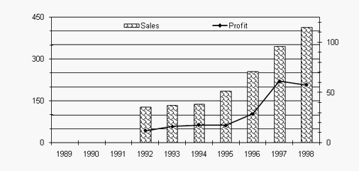
Solution: Return on sales in 1995 = 20/180 or 0.111
Return on sales in 1996 = 30/260 or 0.115
Return on sales in 1997 = 60/345 or 0.173
Return on sales in 1998 = 55/420 or 0.130
So, highest return comes in 1997. Hence answer is option 3.
How many times return on sales (profit/sales) exceeded 15 % ?
1.Once
2.Twice
3.Thrice
4.Never
Solution: Return on sales in 1992 = 12/130 or 0.09
Return on sales in 1993 = 18/135 or 0.13
Return on sales in 1994 = 19/140 or 0.13
Return on sales in 1995 = 20/180 or 0.111
Return on sales in 1996 = 30/260 or 0.115
Return on sales in 1997 = 60/345 or 0.173
Return on sales in 1998 = 55/420 or 0.130
Return on sales exceeds 15% only in 1997.Hence answer is option 1.
How many times growth in profit over the previous year exceeded 50% was registered ?
1.Once
2.Twice
3.Thrice
4.Never
Solution: Profit growth exceeds 50% in 1996 i.e. from 18 to 30 and in 1997 from 30 to 60.This is not happening in any other year.
Therefore answer is twice.Hence answer is option 2.
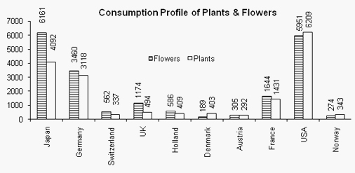
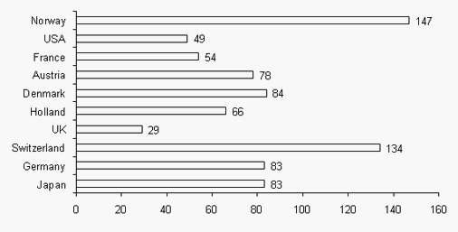
DIRECTIONS for questions 4 to 6 : Refer to the bar charts given below and answer the questions that follow.
First chart gives the consumption of flowers and plants in US Dollar millions.
The second Bar Graph gives the Per Capita Consumption of Flowers and Plants (in US dollars)
What is the approx. total consumption of plants ($ million)?
1.20000
2.18000
3.17000
4.15000
Solution: Total Consumption of plants (4092 + 3118 + 337 + 494 + 409 + 403 + 292 + 1431+ 6209 + 343)=17128. Hence the answer is option 3.
What could be the approximate population of Japan?
1.125 million
2.200 million
3.300 million
4.250 million
Solution: Total consumption of plants and flowers in Japan
= 6161+4092 =10253 million.
As given, per capita consumption = 83.
Population = 10253/83 million =123 million.
Hence the answer is option 1.
By what percent is the total flower consumption more or less than total plant consumption?
1.28% more
2.28% less
3.18% more
4.18% less
Solution: Total plant consumption = 4092 + 3118 + 337 + 494 + 409 + 403 + 292 + 1431 + 6209 + 343 = 17128. Total flower consumption = 6161 + 3460 + 562 + 1174 + 586 + 189 + 305 + 1644 + 5951 + 274 = 20306. Required % = ((20306 – 17128)/17128) × 100 = 18.58%.
Therefore, the total flower consumption 18.58% more than total plant consumption.Hence the answer is option 3.
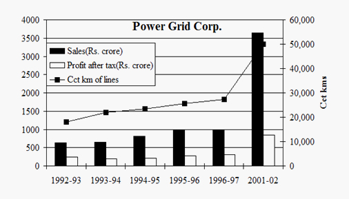
DIRECTIONS for questions 7 to 9: Refer to the following table which is based on Power Grid Corporation.
The highest average annual growth rate in revenue is
1. 270%
2. 154%
3. 108%
4. 54%
Solution: By observation, we can see that there is no growth from 1995-96 to 1996-97. From 1996-97 to 2001-02, the maximum growth is clearly visible from the graph i.e. 1000 to 3700. So,for the five years growth is about 270%. Finally, the average annual growth would be (270/5)= 54%. Hence answer is option 4.
Power Grid Corporation has drawn up a plan to invest Rs 13,200 crore in the period 1996-97 to 2001-02. Assuming that all this investment is to increased circuit km of transmission lines, the anticipated investment required for one km of transmission circuit is
1.Rs 1.80 cr.
2.Rs 0.55 cr.
3.Rs 0.46 cr.
4.Rs 0.50 cr
Solution: Investment is to increased circuit km of transmission lines is = 13200 / (50000 - 26000)
= 13200 / 24000 = 0.55.Hence answer is option 2.
Profitability (Profit / Sales) is the highest in
1.1992-93
2.1993-94
3.2001-02
4.1996-97
Solution: Profit/Sales for 1992-93 = 300/600 = 0.50
For 1993-94 = 200/700 = 0.29. For 2001-02 = 750/3700=0.20. For 1996-97 = 350/1000 = 0.35. So, the profitability for 1992-93 is the highest. Hence answer is option 1.
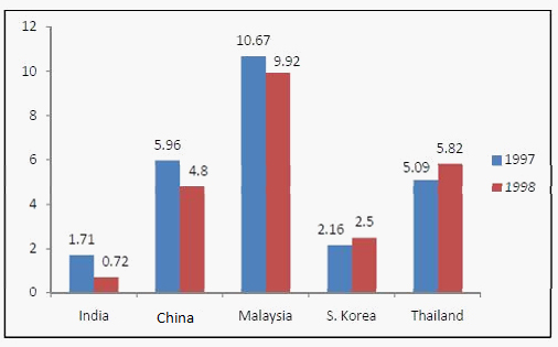
DIRECTIONS for questions 10 to12:The following graph shows the data related to Foreign Equity Inflow (FEI) for the five countries for two years- 1997 and 1998.FEI is the ratio of foreign equity inflow to the country's GDP, which is expressed as a percentage in the following graph.
Find the ratio between FEI for Malaysia in 1997 and FEI for Thailand in 1998
1.7 : 25
2.8 : 21
3.6 : 11
4.1067 : 582
Solution: FEI for Malaysia in 1997 is 10.67 and FEI for Thailand in 1998 is 5.82. So, Required ratio is = 10.67 : 5.82 = 1067 : 582. Hence answer is option 4.
Name the country which has the minimum change in the FEI
1.India
2.China
3.Malaysia
4.S.Korea
Solution: In this question, you are only asked to identify the country with the minimum change and not the percent change. You can calculate this by using the difference between the values given on the top. So, as per this, the answer is. S.Korea as it has the minimum difference of 0.34.
Here, you need to apply the concept of subtraction to find the answer. Hence answer is option 4.
If, Education sector in Thailand had 25% of FEI in 1997 and 60% of FEI in 1998, then find the approx ratio of the amounts allocated to Education in 1997 to 1998. (Assume the GDPs of both of these years for Thailand is same.)
1.1 : 5
2.25 : 72
3.6 : 11
4.7 : 25
Solution: Taking the data from the chart for Thailand you can see that in the year 1997, the FEI is 5.09% of GDP and 25% of it is allocated to the Education sector and in year 1998, 5.82% of the GDP is FEI and 60% of it goes to the Education sector. Now if you try to find it by the conventional method, it will take a lot of time and energy. Now as you have to find the ratio of amount on Education sector in the 1997 and 1998, you can do rough calculations by taking 5.09% as 5% for 1997 and 5.82% i.e. 6% approx. for 1998. After that, calculate ratio as 5 × 25 × GDP : 6 × 60 × GDP = 5x5 : 6x12 = 25 : 72 approximately. Hence answer is option 2.


_0_6.jpg?null)


